Field note 02 · Composition
How to make a bookplate
To make a bookplate, enter the owner’s name, add an optional motto, choose a motif and typeface, and check the preview. Purchase the finished design when you are ready to download and print it.
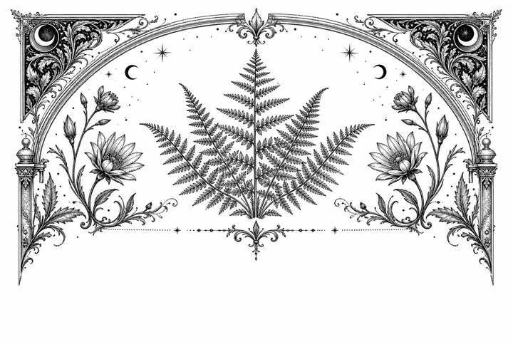
A bookplate is a small piece of composition: a few lines of ownership, an image with a point of view, and enough quiet paper for both to breathe. The most satisfying marks feel specific without becoming crowded. Use the sequence below to decide what belongs, what can recede, and what to inspect before you make a final file.
Before you begin
One design costs $5.90 once and includes SVG, 2400 × 1600 PNG, and eight-up A4 and US Letter PDFs. The preview is watermarked; purchased files are not. Finalize your wording and visual choices before purchase: changing them creates a new design that requires another purchase. No physical labels are shipped.
Personalize your bookplateStart with the owner line
The owner line is the reason the plate exists, so let it set the direction. Begin with the exact name, initials, household, or library name you want to see when the book opens. Write it as you would like it to appear; a familiar name will feel more personal than a formal version added only for ceremony.
Ex libris gives the line a traditional bookish rhythm, while “from the library of” is direct and easy to understand. A family library can use its own name, and a reader who prefers a quieter mark might choose initials. None of these forms is mandatory. The useful test is simple: can someone tell whose book it is without having to decode the design?
- A personal name: use the spelling, accents, and order that feel natural to the owner.
- A household or family library: choose the name that will still make sense as the shelves change.
- Initials or a monogram: keep the mark spare when the books already carry a strong visual identity.
Before choosing ornament, read the owner line on its own. It should be the first clear thought in the composition, not a caption hidden beneath it.
Add an optional motto
A motto can add a private note, but it is an invitation rather than a requirement. If the owner line and motif already say enough, leaving the motto blank may give the plate its best balance. Add one when a short phrase brings a feeling, a habit, or a bit of wit that belongs to the library.
Choose words with a natural rhythm and check every mark of punctuation. A motto in italics can feel inward and literary; an upright line can feel more formal. Keep its visual role secondary to the owner line, and do not make it explain the whole image. A phrase that leaves a little room for association will age more gracefully than a sentence that tries to describe everything.
The motto should open a door into the library, not become another sign telling the reader where to look.
Choose a type voice
Type carries atmosphere before a reader has finished the words. The maker separates the overall edition from the typeface, which lets you compare a visual frame and a lettering voice without losing the central idea. Start with the owner line, then let the motto take a quieter register.
- Cormorant: elegant and literary, with a graceful presence for a name at the center.
- Baskerville: a classic book serif when you want the wording to feel settled and familiar.
- Garamond: a humanist old-style voice that keeps the mark warm and readable.
- Cinzel: a formal inscription for a plate that wants a little ceremony.
These voices can all work; the question is which one lets the owner line sound like itself. Watch for long names, repeated capitals, and unusual punctuation. A typeface may look beautiful in a sample and still need more breathing room when it holds the actual name. Keep the hierarchy obvious: the owner line first, the motto second, and any small edition wording last.
Let one motif lead
A motif gives the bookplate its emblematic quality. Choose one image that feels connected to the reader or the room, then let it carry the atmosphere without asking it to illustrate every interest. The maker’s moth, owl, cat, and fern motifs each suggest a different kind of presence; the right choice is the one you will be glad to meet each time the cover opens.
Look at the silhouette first, then look at the details. A detailed engraving needs open space around the words, while a simpler shape can tolerate a little more typographic emphasis. The image should support the owner line rather than compete with it. If you find yourself adding a second symbol to explain the first, return to the strongest single clue and give it more room.
The chosen edition also changes the mood of a motif. Atelier engraving can feel collected and finely observed; Gothic, botanical, or vintage library treatments pull the same act of ownership in different directions. Compare them with the actual name in place, not with placeholder text.
Tune contrast and space
Contrast is more than choosing a dark ink. It is the relationship between line weight, letter size, image density, and the paper around them. An intricate border can make small text feel timid; a generous margin can give the same text authority. Think of the empty areas as part of the mark, not as unused space.
Begin with the clearest ink-and-paper pairing, then try a quieter color if the owner line and fine engraving remain easy to read. Oxblood, forest, and midnight can shift the feeling of the plate, but color should never be asked to rescue weak hierarchy. If the motif is dense, protect the name with clear separation. If the motif is airy, allow the type to carry a little more presence.
Step back from the screen and check the whole field at once. The owner line should be findable immediately, the motto should recede without disappearing, and the border should frame rather than close in. A grayscale glance is useful too: it reveals whether structure is doing the work or whether the design depends only on color.
Make a proof at the book’s scale
A screen makes every detail feel larger than it will be inside a cover. Before purchase, check the watermarked preview, spelling, motif, and typeface carefully. After purchase, print one proof on ordinary paper before using your final stock. A printed proof tests physical size and printer settings; it does not make later wording or style changes part of the same purchase.
- Read the name first. Check the spelling, accents, line breaks, and the balance of the owner line.
- Inspect the small details. Make sure the motto remains legible and that fine rules, stars, leaves, or other engraving lines do not vanish into one another.
- Place the proof in context. Hold it inside the front cover and notice whether the margins feel intentional or whether the frame is crowding the hinge and edges.
- Revise once with purpose. Change the one thing that is asking for attention—type, motif, contrast, or scale—then read the complete mark again.
Proofing is not a test of whether the design is impressive at a glance. It is a check that the mark remains calm, clear, and personal when it takes its real place in the book.
Use the maker in sequence
The maker is a small design bench: it keeps the decisions visible while you compose them. Work from language outward, and pause whenever a new choice makes an earlier one harder to read.
- Enter the owner line. Start with the name, initials, or library wording that gives the plate its purpose.
- Add the motto only if it earns its space. Leave it empty when the owner line and motif already feel complete.
- Compare the editions. Let the overall frame establish the atmosphere before you fine-tune the lettering.
- Choose the typeface. Keep the owner line easy to find and give the motto a supporting voice.
- Select one motif. Check the image with your real wording so its scale and density are honest.
- Try the ink and paper relationship. Look for clear contrast, generous breathing room, and a mark that belongs with the books it will enter.
- Read the live preview at scale. Inspect the smallest details, then return to the earlier choice that needs adjusting.
At the bench
Compose, then let the proof decide.
When the words, type, motif, and contrast are working together, use the maker to compose the mark and study its live preview before preparing the final digital files.
Compose and preview your bookplateIf you are beginning with the tradition itself, read what an ex libris means first. When the composition is settled, continue to how to print bookplates for the paper, scale, and placement decisions that come next.