Field note 01 · Origin
What is an ex libris?
Ex libris is Latin for “from the books of.” A bookplate is a label placed inside a book to identify its owner, often with a name, an illustration, and a short motto.
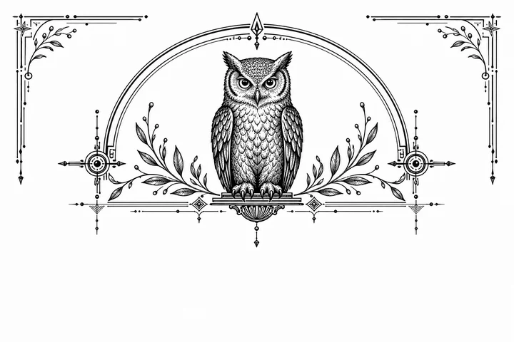
Ex libris is Latin for “from the books of.” An ex libris bookplate is a small printed ownership mark, usually placed inside the front cover of a book. It identifies a library or reader, but its most memorable quality is often more intimate: a few words and a small image can tell you what kind of room the books belong to.
What the phrase tells you
The traditional wording is followed by a name: Ex libris Elena Marlowe, for example, or Ex libris the Marlowe library. “From the library of” says the same thing in plain English. Neither form is a password or a strict formula. The Latin version carries a familiar bookish rhythm; the English version can feel warmer, clearer, or better suited to a longer household name.
Bookplates became especially useful as personal libraries and printed matter grew. Before a dedicated plate, owners might write their names by hand or add a note to the title page. A printed mark made that act repeatable. It also offered a small surface for graphic expression: linework, a motto, a monogram, a creature, a plant, or an emblem chosen because it feels like the owner.
An ex libris is an ownership signal, not an appraisal or a guarantee of provenance.
The anatomy of a useful bookplate
There is no single correct layout, but most successful bookplates make a handful of decisions clearly:
- The ownership line: a name, initials, family library, or studio name gives the mark its purpose.
- A visual voice: engraving, woodcut, botanical linework, and vintage catalogue language each set a different mood.
- A supporting motif: the image should add character without competing with the words at the center.
- Enough breathing room: the paper around the mark is part of the composition, especially once the plate is reduced inside a cover.
A little private heraldry
Think of the motif as a clue rather than an illustration of everything you enjoy. A moth can suggest night reading and transformation; an owl can lean toward watchfulness and study; a fern can make the library feel rooted; a cat can bring in domestic mischief. The strongest choice is usually one image with enough open space to survive at small scale.
Typography does a similar kind of work. A formal serif can make a short name feel ceremonial, while a softer italic voice can make a motto feel handwritten. Keep the number of type styles restrained. The point is not to show every available face; it is to make the owner’s name easy to find and pleasant to return to.
Where an ex libris belongs
The usual home is the front pastedown: the endpaper attached to the inside of the front cover. It is distinct from the free endpaper that turns like a page. It is visible when the book opens, but it does not interrupt the title page or reading text. A smaller plate can sit higher or lower depending on the cover, while a generous margin around the mark helps it feel intentional.
Place the bookplate on a clean, dry surface and smooth from the center outward. If you are working with a valuable or delicate volume, test the adhesive and paper on a less important book first. A beautiful mark should age with the library, not put the binding at risk.
From definition to design
Once you know what the mark needs to say, the making becomes a short sequence of thoughtful choices. Use the next note to plan the wording, type, motif, and proof.
Read how to make a bookplate